Tour Operator Website Design That Books
I’ve reviewed thousands of tour operator websites. Most of them are terrible.
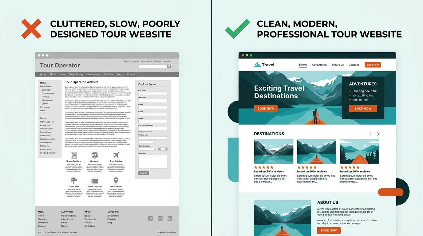
Not terrible in the “ugly” sense — though many are that too. Terrible in the sense that they actively lose bookings. Slow load times, buried booking buttons, stock photos of people who’ve clearly never been on a kayak, and mobile experiences that make you want to throw your phone into the ocean.
Here’s the thing: your website is your highest-converting sales channel. Not TripAdvisor. Not Instagram. Not that flyer you put in the hotel lobby. A traveler who lands on your website has already searched for what you offer. They’re ready to book. The only question is whether your site makes it easy — or drives them to a competitor.
This guide breaks down what actually makes a great tour operator website, backed by data and 15 years of building technology for tour and activity operators.
The 8 Elements Every Great Tour Operator Website Needs
1. Lightning-Fast Speed (Under 2 Seconds)
A one-second delay in page load time reduces conversions by 7%. For a tour operator doing $300,000 in annual online revenue, that’s $21,000 lost — to slow hosting.
Google’s own data shows that 53% of mobile users abandon a site that takes longer than 3 seconds to load. Most tour operator websites I’ve audited load in 5-8 seconds. That’s not a minor problem. That’s hemorrhaging money.
What kills speed on tour websites:
- Unoptimized images: A single 5MB hero photo can add 3-4 seconds of load time on mobile
- Too many third-party scripts: Chat widgets, analytics, social embeds, booking widgets all competing for bandwidth
- Cheap shared hosting: Your $4/month hosting plan is sharing a server with 500 other sites
- Heavy WordPress themes: That “beautiful” theme with 40 features you don’t use adds 2 seconds of dead weight
The fix isn’t complicated. Compress images (WebP format, under 200KB each). Use a CDN. Defer non-critical scripts. Or use a platform that handles this automatically — Gondola sites score 90+ on PageSpeed Insights out of the box because we build on static site architecture, not bloated CMS platforms.
2. Mobile-First Design
63% of travel-related searches happen on mobile devices. Not “mobile-responsive as an afterthought” — mobile-first.
There’s a critical distinction. A mobile-responsive site takes a desktop layout and squishes it onto a phone screen. A mobile-first site is designed for thumbs, small screens, and 4G connections from the start — then scaled up for desktop.
What mobile-first means for tour operators:
- Tap targets at least 44x44 pixels — those tiny “Book Now” links that work with a mouse cursor are invisible to a thumb
- Booking widget visible without scrolling on mobile
- Image galleries that swipe, not click
- Phone number that’s tappable — one tap to call, not copy-paste
- Forms with minimal fields — nobody fills out 12 fields on a phone
Google switched to mobile-first indexing in 2023. That means Google evaluates the mobile version of your site — not the desktop version — when deciding where to rank you. A beautiful desktop site with a broken mobile experience is an SEO liability.
3. Hero Imagery That Sells the Experience
Stock photos are the enemy of conversion. When a traveler lands on your site and sees a generic photo of smiling models on a boat, they know it’s fake. Trust evaporates instantly.
The best tour operator websites use:
- Real photos from actual tours — even imperfect phone shots outperform polished stock
- Action shots that put the viewer in the experience — the view from the kayak, not a photo of kayaks on a rack
- Destination-specific imagery — show YOUR marina, YOUR trail, YOUR coastline
- Video backgrounds — a 10-second loop of your actual tour converts better than any static image
One operator I worked with replaced their stock hero image with a real customer photo from a sunset sail. Booking conversion rate increased 23%. That’s not a typo.
Invest in a professional photo shoot once a year, then supplement with curated customer photos throughout the season. It’s the highest-ROI marketing investment a tour operator can make.
4. Clear Booking Flow
The booking button should be visible within 2 seconds of landing on any page. Not buried under three paragraphs of welcome text. Not hidden in a hamburger menu. Visible, obvious, and compelling.
The best booking flows I’ve seen follow these principles:
- “Book Now” button above the fold on every page — in a contrasting color that’s impossible to miss
- 2-3 clicks from landing to checkout — select date, select party size, pay
- Calendar availability shown inline — don’t make them click through to discover you’re sold out
- Pricing visible before the booking form — travelers who feel surprised by the price at checkout abandon at 3x the rate
- Trust signals near the CTA — star rating, review count, “Free cancellation” badge
A boat tour operator in Miami had their booking widget at the bottom of a 2,000-word page. We moved it above the fold and added a sticky “Book Now” button on mobile. Bookings increased 34% in the first month with zero additional traffic.
5. Social Proof That Builds Trust
94% of travelers say online reviews influence their booking decisions. Yet most tour operator websites either hide their reviews on a separate page nobody visits, or don’t display them at all.
Social proof should be woven throughout your site:
- Star rating and review count in the hero section — “4.9 stars from 2,847 reviews” is more persuasive than any headline you could write
- Selected review quotes on tour pages — not a link to TripAdvisor, but actual quotes right next to the booking button
- Customer photos in galleries — user-generated content is trusted 2.4x more than brand-created content
- Trust badges — TripAdvisor Travelers’ Choice, Google rating, “As seen in” press logos
- Video testimonials — even a 30-second phone video from a happy customer is worth more than a polished marketing video
The operators who display reviews prominently — right next to the booking CTA — consistently outperform those who don’t. This isn’t a nice-to-have. It’s a conversion fundamental.
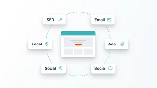
6. Destination and Activity Content
Your website shouldn’t just sell tours — it should be the definitive resource for your activity in your area. This serves two purposes: it builds trust with visitors (“this operator really knows their stuff”), and it drives organic search traffic from travelers in the planning phase.
Every tour operator website should have:
- Destination guides — “Best Time to Visit [Location]”, “What to Pack for [Activity]”, “Top Things to Do in [City]”
- Activity-specific content — “Beginner’s Guide to [Activity]”, “[Activity] Safety Tips”, “What to Expect on Your First [Activity]”
- Local knowledge — weather patterns, seasonal highlights, insider tips that only a local would know
- Blog posts targeting planning-phase keywords — these capture travelers months before they book, building brand recognition early
This content does double duty: it improves your SEO rankings and gives visitors a reason to trust you over a faceless OTA listing. Travelers book from operators who demonstrate expertise.
7. Structured Data and Schema Markup
This is the technical element most operators miss entirely — and it’s one of the highest-leverage changes you can make.
Structured data tells Google (and AI search engines like ChatGPT and Perplexity) exactly what your business offers. When implemented correctly, your search listings show star ratings, price ranges, availability, and FAQs directly in the results.
Tour operator websites should implement:
- TourOperator schema — your business name, location, contact info, service area
- Event/Product schema — each tour with pricing, duration, availability
- Review schema — aggregate ratings that display stars in search results
- FAQ schema — common questions that can appear as rich snippets
- LocalBusiness schema — for Google Maps and local pack visibility
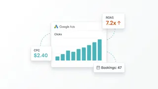
A tour listing with star ratings and pricing in Google results gets 35-40% more clicks than one without. That’s free traffic from markup that takes minutes to implement.
On Gondola, all of this is generated automatically from your tour data. No code, no plugins, no technical knowledge required.
8. Responsive Design That Works on Every Device
This goes beyond mobile. Your site needs to work flawlessly on:
- Phones (iPhone, Android, various screen sizes)
- Tablets (travelers browsing from hotel rooms and airports)
- Desktop (office workers planning their next vacation)
- Large screens (your images should scale up beautifully, not stretch into pixelated messes)
Test your site on at least 5 different devices. What looks fine on your iPhone 16 might be broken on a Samsung Galaxy A15 — and budget Android phones account for a huge share of global web traffic, especially among travelers browsing from abroad.
Common Website Mistakes Tour Operators Make
After auditing hundreds of tourism websites, these are the patterns I see over and over:
The “Wall of Text” homepage. Your homepage isn’t a brochure. Visitors scan — they don’t read. If your homepage has 1,500 words of unbroken text before the booking button, you’ve lost 80% of visitors before they scroll past the first screen.
Autoplay music or video with sound. It’s 2026. I still see this. Stop it.
No clear call-to-action. I’ve seen tour websites where I genuinely couldn’t figure out how to book. The booking link was buried in a submenu under “Services > Tours > Details > Book.” Three clicks too many.
Listing every tour on one page. If you offer 15 different tours, each one deserves its own page with its own photos, description, reviews, and schema markup. One giant list page with two-sentence descriptions for each tour is a missed opportunity for both SEO and conversion.
Ignoring page speed. “It loads fine on my wifi” isn’t a benchmark. Test on a throttled 3G connection — that’s what your customer is dealing with while standing on a street corner in your destination city, trying to decide if your tour is worth booking.
Using their booking system as their website. FareHarbor, Peek, and Checkfront make great booking engines. They don’t make great websites. Your booking system should power your checkout, not be your entire online presence. You need a proper website with content, design, and SEO — with the booking widget embedded in it.
DIY vs. Agency vs. Website Builder: An Honest Comparison
There are three paths to getting a tour operator website. Each has real tradeoffs.
DIY (WordPress, Squarespace, Wix)
Cost: $0-$200/month + your time Timeline: 2-8 weeks Pros: Full control, low cost, thousands of templates Cons: You’re the designer, developer, SEO specialist, and IT department. WordPress sites need constant updates, security patches, and plugin management. Generic templates don’t account for tour-specific needs like booking integration, tour schema, or availability displays.
Best for: Operators who genuinely enjoy building websites and have 20+ hours to invest upfront.
Tourism Agency (Tourism Tiger, etc.)
Cost: $5,000-$15,000+ upfront, $200-$500/month ongoing Timeline: 4-12 weeks Pros: Professional design, tourism-specific expertise, someone else handles the tech Cons: Expensive. Slow turnaround on changes. You’re dependent on the agency for every update — want to change a photo? Submit a ticket and wait. Many agencies lock you into proprietary platforms, so you can’t leave without rebuilding from scratch.
Best for: Large operators with budget to spare who want fully custom design work.
Purpose-Built Website Builder (Gondola)
Cost: $49-$99/month with no upfront cost Timeline: Live in days, not weeks Pros: Built specifically for tour and activity operators. AI generates a professional draft site from your business details. Booking widget integration, tour schema, SEO, and speed optimization are all built in. You can tweak anything yourself whenever you want — no tickets, no waiting. Cons: Less custom than a fully bespoke agency build. You’re working within a system designed for tour operators, not a blank canvas.
Best for: The 90% of operators who want a professional website that works, without spending months or thousands of dollars building it.
I built Gondola because I saw this gap firsthand. Operators were stuck between janky DIY sites that didn’t convert and expensive agency builds they couldn’t update themselves. The builder model gives you professional quality with self-service control.
Niche-Specific Design Considerations
Not all tour websites are the same. What works for a food tour doesn’t work for a helicopter tour. Here’s what matters for each niche:
Water Activities
Boat tour websites need fleet galleries showing each vessel, capacity details, and marina/departure location maps. Travelers want to see the actual boat they’ll be on — not a generic stock photo of a yacht.
Kayak tour websites should highlight skill-level suitability prominently. A family looking for a gentle paddle and an experienced kayaker seeking whitewater rapids need to self-select quickly. Trail maps and wildlife spotting galleries build excitement.
Fishing charter websites live or die on catch galleries. Show recent catches with species, size, and date. Seasonal catch calendars and equipment-included lists reduce pre-booking friction.
Surf school websites need clear lesson-level breakdowns (beginner, intermediate, advanced) with progression paths. Wave condition information and instructor credentials build credibility with parents booking for teens.
Snorkeling and diving websites require site-specific underwater photography — travelers want to see the actual reef or wreck they’ll be visiting. Visibility conditions, marine life checklists, and certification requirements (for diving) are must-haves.
Jet ski rental websites should emphasize safety credentials, age/license requirements, and rental duration options prominently. Video content of the actual waterways performs exceptionally well for this niche.
Land Adventures
Hiking tour websites absolutely need trail difficulty ratings, elevation profiles, and distance information. What-to-bring checklists and fitness-level recommendations reduce customer service inquiries by up to 40%.
Horseback riding websites should showcase the horses and trails with authentic photography. Experience-level matching, weight limits, and age requirements need to be transparent — not hidden in fine print that frustrates visitors.
ATV tour websites sell adrenaline. Hero video works better than photos for this niche. Trail maps, safety briefing info, and group size limits should be front and center.
Food, Drink & Culture
Food tour websites need itinerary showcases that reveal the food stops, cuisine types, and dietary accommodation options. Mouth-watering food photography is non-negotiable. Walking distance and duration matter to guests with mobility concerns.
Wine tour websites should feature vineyard imagery, tasting notes or featured wineries, and transportation details (this is the niche where “we handle the driving” is a primary value proposition). Group booking options and private tour upsells perform well.
Bar crawl websites target a younger demographic and should reflect that energy — bold visuals, social media integration, group booking discounts prominently displayed, and “what’s included” clarity (cover charges, drinks, etc.).
Aerial & Unique Experiences
Helicopter tour websites are selling a premium experience, and the design needs to match. Cinematic aerial photography or video is essential. Route maps showing flight paths, safety records, and pilot credentials justify premium pricing.
Axe throwing websites target team-building and social groups. Event/party booking options, group pricing, and competitive/league elements should be prominent. The vibe should be fun and approachable, not intimidating.
Walking and bus tour websites serve the broadest demographic — from school groups to seniors. Accessibility information, tour duration, meeting point details with maps, and multi-language support (especially in tourist-heavy cities) are critical.
How to Evaluate Your Current Website: The 5-Minute Audit
Grab your phone. Open your tour website. Answer these questions honestly:
Speed
- Does the page load in under 3 seconds on mobile data?
- Run PageSpeed Insights — is your mobile score above 70?
Mobile Experience
- Can you book a tour in under 3 taps from the homepage?
- Is the “Book Now” button visible without scrolling?
- Can you read all text without pinching to zoom?
Visual Quality
- Are all hero images real photos from your actual tours?
- Are images sharp and properly sized (not stretched or pixelated)?
Trust Signals
- Are star ratings and review counts visible on the homepage?
- Are customer testimonials near your booking CTA?
Content & SEO
- Does each tour have its own dedicated page?
- Do you have at least 5 blog posts targeting local travel keywords?
- Is structured data implemented? (Check with Google’s Rich Results Test)
Technical
- Is your site on HTTPS?
- Do all links work (no 404 errors)?
- Does the site look correct on both iPhone and Android?
If you answered “no” to more than three of these, your website is costing you bookings. Not hypothetically — measurably.
Your Website Is Your Best Salesperson
A great tour operator website works 24/7. It doesn’t call in sick. It doesn’t forget to mention the sunset upgrade. It doesn’t get flustered when five people want to book at the same time.
But it only works if it’s built right. Fast. Mobile-first. Visually compelling. Easy to book. Dripping with social proof. Technically optimized for search engines and AI.
The gap between a mediocre tourism website and a great one isn’t aesthetics — it’s revenue. Operators who invest in getting their website right see 20-50% increases in direct bookings, reduced OTA dependency, and higher average order values from upsells that a well-designed site can present at the right moment.
If you’re ready to stop losing bookings to a website that doesn’t represent your business, see what Gondola can build for you. We generate a professional, conversion-optimized site from your business details using AI — then you can tweak every detail yourself, on your schedule, without submitting a single support ticket.
View pricing | See features | Learn about SEO for tour operators
Frequently Asked Questions
It depends on the route you take. A freelance designer charges $3,000-$10,000 upfront plus $100-$300/month for maintenance. A tourism-specific agency like Tourism Tiger charges $5,000-$15,000+ with ongoing fees. A purpose-built website builder like Gondola starts at $49/month with no upfront cost — the site is AI-generated and ready to customize immediately. For most small to mid-size operators, a website builder offers the best balance of quality, cost, and control.
The best platform depends on your technical skill and budget. WordPress offers flexibility but requires constant maintenance, security updates, and plugin management. Squarespace and Wix are easy but not built for tour operators — they lack booking widget integration, tour schema markup, and activity-specific layouts. Purpose-built platforms like Gondola are designed specifically for tour and activity operators, with booking integration, SEO, and conversion optimization built in.
Critical. Over 60% of travel-related searches happen on mobile devices, and Google uses mobile-first indexing — meaning it evaluates the mobile version of your site for rankings. A tour website that doesn't work well on phones is losing the majority of its potential customers. Your booking flow, image galleries, and navigation must all work flawlessly on a 5-inch screen.
Your website should never feel stale. At minimum, update seasonal availability, pricing, and imagery before each peak season. Blog content should be added monthly to support SEO. Customer reviews and photos should be refreshed quarterly. The biggest mistake operators make is treating their website as a one-and-done project — it should evolve as your business does.